Hong Kong Residence Maximizes Space & Minimalism with Scandinavian Style and Feng Shui Principles
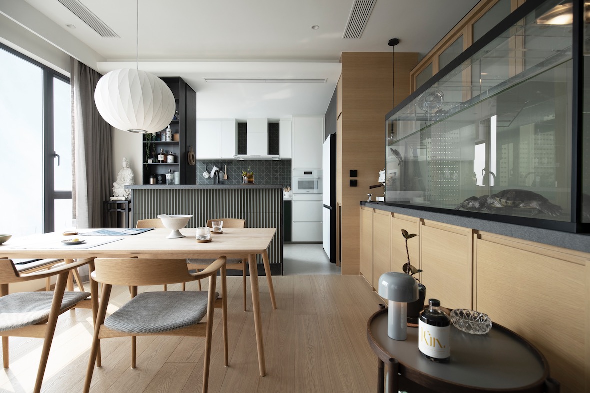
This mid-century modern penthouse with heavily Scandinavian design influences was designed in Hong Kong by Keith Chan of Hintegro Studio. He utilizes a neutral color scheme with contemporary textures and modular features.
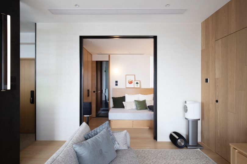
The size of the penthouse sits high above the neighborhood, but is relatively small in size. At only 1992 square feet, with narrow passageways, Chan needed to create an open, airy space with multi-functional furniture and modular aspects. Additionally, emphasizing some principles of feng shui to balance the entirety of the penthouse scheme. Throughout the space, 3 continuous elements remain consistent. The first element is the light wood used for the fixtures, trim, staircase and many of the furnishings. The second element is dark metal (dark green, gray and black) creating a beautiful and minimalist contrast while defining and connecting the rooms together. The third element is the fluted texture found on the doors, kitchen island and other areas of the household.
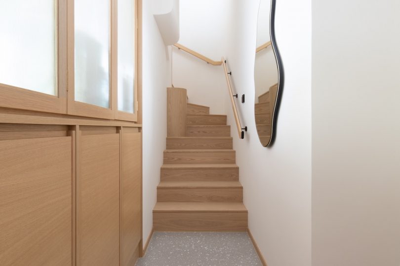
Classic mid-century modern Scandinavian furniture and mid-century modern architecture is oftentimes defined by clean-cut lines, rigid shapes and geometric symmetry. This can be found throughout much of the residences design. However, to break up the monotony, the use of amorphic décor and other unique accents give the space personality and character beyond classic, straight-laced, Scandi-style.
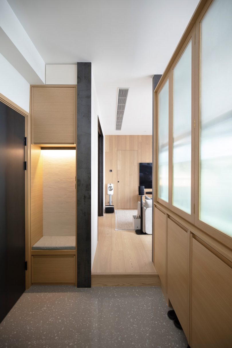
In the living room, a sliding door made from metal and Japanese Shikui plastering helps expand the space. The concealed room can also serve as a guest bedroom with a sofa bed and its own personal bathroom. The low-profile sofa bed frame is made from block-style wood, similar to the light to medium shade found throughout the entire penthouse. As for the main bedroom, in a beautiful juxtaposition perpendicular fashion, the wood paneled wall where the TV is mounted to, matches its flooring. The bed frame features a dark metal headboard creating another visually pleasing effect complementary and contrasted to the Japanese Shikui plastering wall.
You wouldn’t believe it by the size, but there is also a home office as well. This study area is separated from the bedroom with a built-in wooden shelf, it serves as both a partition (hiding the projector movie screen installed in the ceiling!) and storage room for the couples book collection.
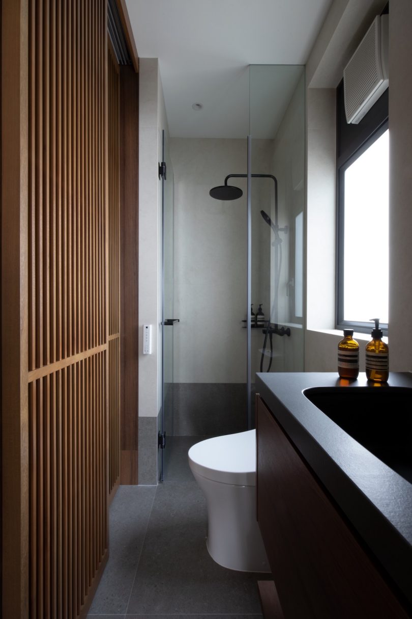
As you can see from the bathroom door, the fluted glass doors and wooden doors provide a consistent textured theme. The dark colors with monotone tiles bring forth minimalist modernism in one of the most private, personal sanctuaries in the home. Translucency in the form of glass and other see-through materials, as well as room dividers promote the flow of chi from one room to the next. This is one of the fundamental principles found in some Feng Shui practitioners roster.
Not seen in the photos, but just to give you a grander scope of how amazing the design of this Hong Kong penthouse is: The penthouse features its own balcony and a rooftop with a large space for parties and guests. It is hooked up with a sound system, outdoor show, kitchenette and foliage to give it those outdoor vibes. This penthouse takes mid-century minimal and modern modular to the next level!
