Clashing Colors and Prints – The Big No-No’s at Home
We may have our minds made up about what colors we want in our living space but some colors just DO NOT work well together. Many of these design faux pas have to do with tones of colors. While others are much more obvious. Let’s explore what color and print combinations do not look good together so you can avoid making these design mistakes in the future.
Navy Blue and Chocolate Brown

As a wood trim or a walnut finish, these two colors could possibly make a decent partnership, but it is difficult to pull off. For upholstery, steer far away from navy blue fabrics mixed with chocolate brown fabrics. These colors clash making the entire room look dull and drab. In fact, it can be very difficult finding the right shades that will marry the two colors for a harmonious setting. Ideally, as a rule of thumb, brown fabrics and brown upholstery should be used sparingly.
Too Many Animal Prints

Is this the house of a rockstar, the pad of a giglio or were you attempting to add a bit of glam to your space? A well-placed animal skin rug, a leopard print throw blanket accent or a zebra print upholstered chair may serve your space well. However, too many animal prints, whether or not they are the “same” print, will need a designer with a keen eye to orchestrate this properly. It may be possible, but if done wrong, the tackiness is strong.
Cherry Red and Bright Orange

Did anyone say “I’m lovin’ it?” Do you want your home to look like a fast-food restaurant or a welcoming sanctuary? These two colors separated can be absolutely stunning, but together – “did anyone want fries with that?”
Black Walls

You may think the color black will help the colors POP in your living space. Reality is, black walls do nothing but darken the entire atmosphere adding nothing but a grim and glum setting to your living space. They are nearly impossible to make look good unless your Morticia from the Adams Family. Even as a vampiric vixen, you may still have trouble enticing guests to spend the evening.
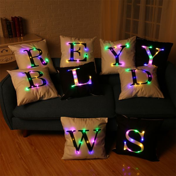
Decorative Letters and Words

We know this may be a trend among some instagram interior designers and other kitschy decor fans. However, lettering everything in your home with catch phrases or labels in “interesting” font is a bit overkill. One or two decals or embroidered pillows may look decent, but when it is overdone, it is tackiness to the fullest. Not only does it become cumbersome to the eyes, but it starts to make us feel like we are living inside of a dictionary come to life.
Now that you know some of the big No-No’s of interior design, you can start your journey towards better choices when designing your next room!