Moscow Apartment Uses “Color Pockets” in Interior Design
An apartment in Moscow uses color as the primary tool in its interior design creating a palette of colorful impressions creating a story while separating the areas and inspiring its creative resident.
In the bedroom, soft pastel hues create a calm yet uplifting atmosphere. The borders of the windows are painted in light pink surrounded by light gray walls complementing the velvet, peach colored bed frame.
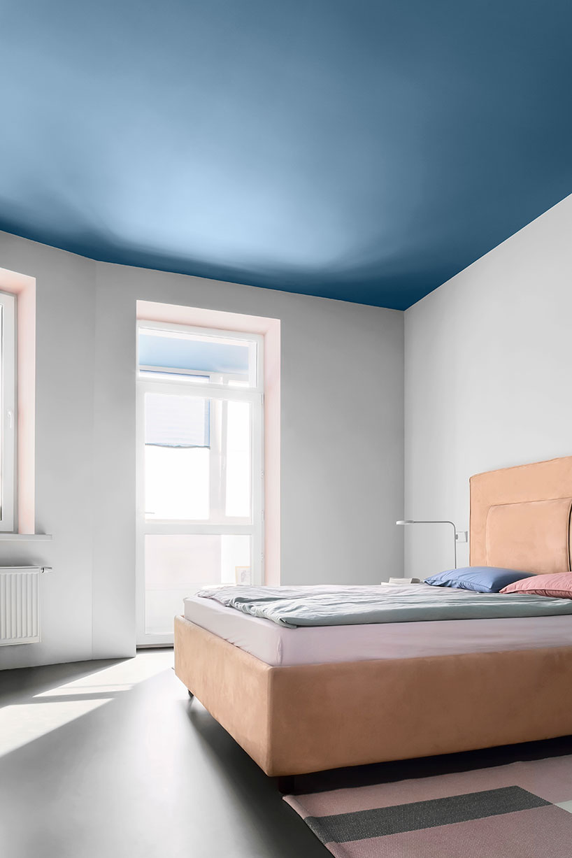
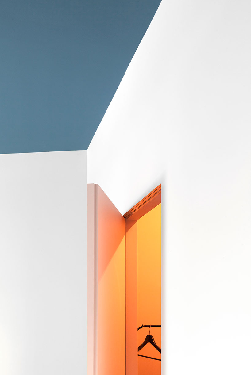
Above, the ceiling is a matte sapphire blue. The bedroom closet is painted in a vibrant and energetic orange bursting with color when opened.
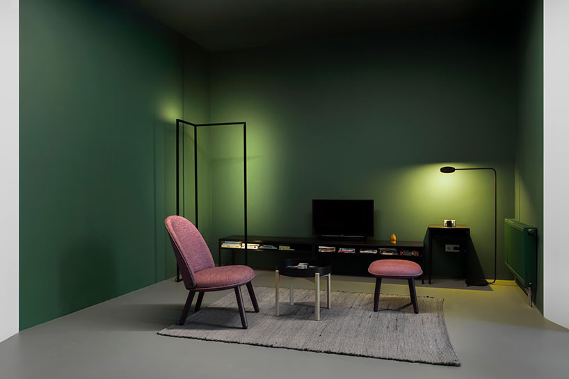
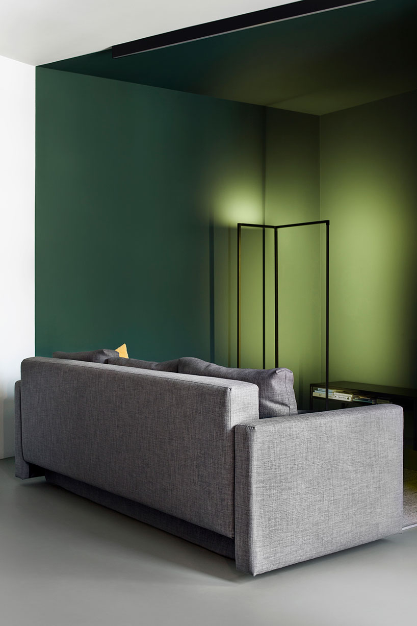
The living room walls and ceiling are painted in a deep forest green. However, the entirety of the wall isn’t completely painted. A few inches of space on both sides of the frame are painted white. The designers call this technique a “color pocket.” This separates the passage into the living room from the rest of the space.
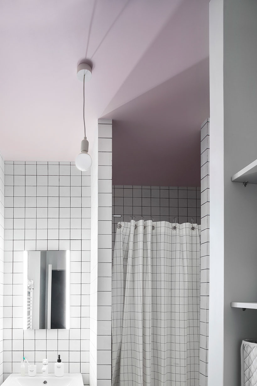
In the bathroom, white grid tiling with dark outlines are used on the walls with the same pattern applied to the shower curtain to continue the design. The ceiling is painted in a shade of light pink which both stands out and complements the grid tiling below it.
Color in interior design can be used for more than just beauty but as a tool to highlight certain areas and to enhance your quality of living at home.